Back
Educational
How to Design Banner Ad for Your Newsletter (7 Easy Steps)

Sophie
Marketing Consultant
Newsletter banner ads can be incredibly powerful if designed right. Whether you're promoting a product, announcing a new feature, or simply increasing brand visibility, a well-designed banner ad can drive clicks and boost engagement. But what makes a banner truly stand out inside an email?
In this guide, we’ll walk you through seven easy steps to design banner ads that not only grab attention but also get results. These principles are based on proven design techniques, marketing psychology, and best practices used by top brands in email marketing.
Step 1: Choose the Right Size and Placement
Banner ads in newsletters work best when they’re optimized for the email layout. The two most common sizes are:
Leaderboard: 728x90 pixels
Medium Rectangle: 300x250 pixels
Consider where the banner will be placed on top, middle, or bottom. Top banners often perform better because they’re immediately visible. Make sure your design is responsive so it displays properly on both desktop and mobile devices.
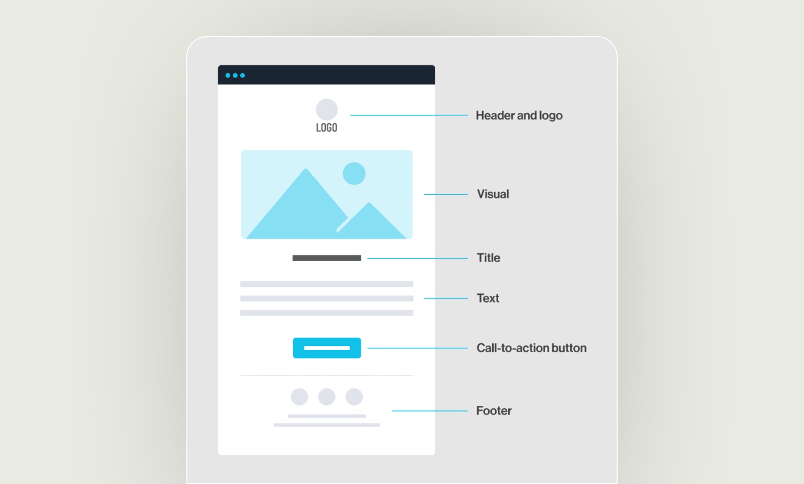
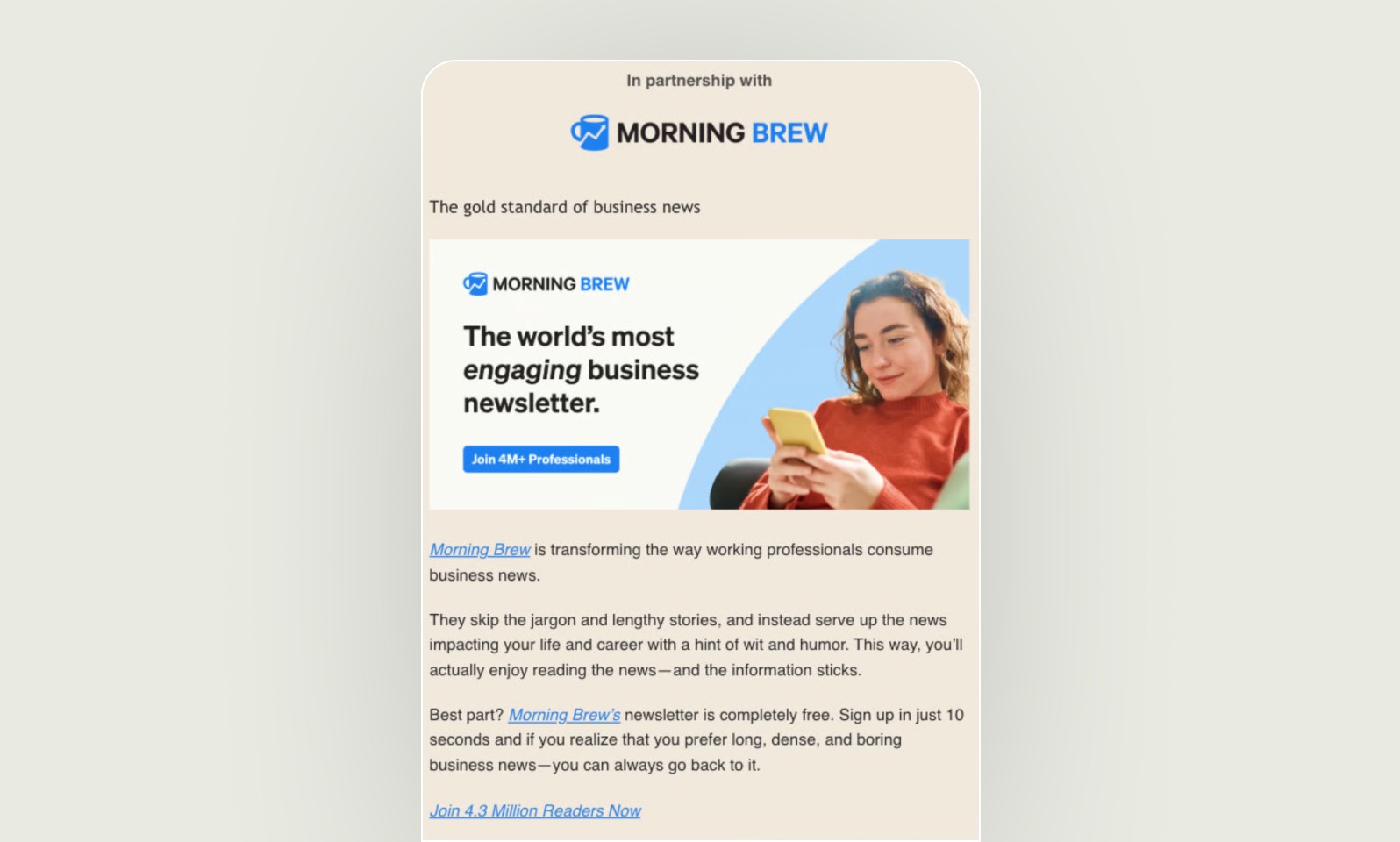
Step 2: Use a High-Quality Visual
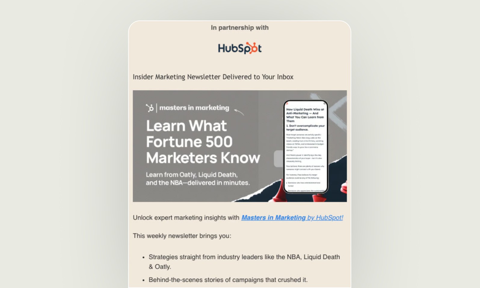
The visual element is the first thing your reader notices. Choose a clear, high-resolution image or illustration that aligns with your message. Avoid cluttered visuals and make sure the image doesn't distract from your call-to-action. Simplicity is key.
If you're showcasing a product, use a clean product shot with ample white space. If it's a service or event, consider using vector icons or lifestyle images that represent the value you're offering.
Step 3: Keep Text Short and Clear
Too much text can overwhelm a banner. Aim for one main message or value proposition. Keep it under 10 words and use large, legible fonts. Focus on benefits rather than features. For example:
Instead of: “Our All-New AI Writing Platform is Now Live”
Try: “Write Smarter with AI”
Make sure your message aligns with the subject line and the rest of your newsletter to create a seamless reader experience.
Step 4: Add a Strong Call-to-Action (CTA)
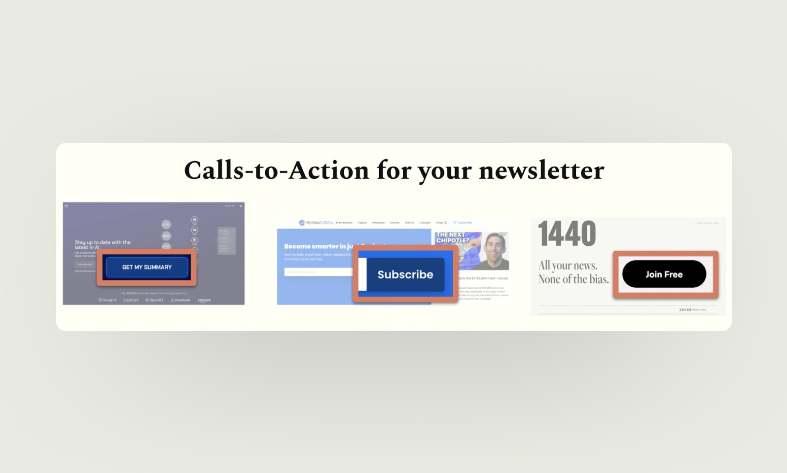
Your CTA should be impossible to miss. Use action words like:
Subscribe Now
Learn More
Get the Deal
Try It Free
Use contrasting colors to make the CTA button stand out from the background. Position it in a place that naturally draws the eye, such as the lower right corner of the banner.
Step 5: Apply Balanced Design Principles

Use the 80/20 rule: 80% visuals and 20% text. This keeps the design clean and helps readers digest information quickly. Use whitespace to separate elements and guide the reader’s eye through the ad. Stick to your brand’s color palette and font styles to maintain consistency.
Avoid using more than two fonts or too many colors. A consistent, polished look improves credibility and trust.
Step 6: Optimize for Mobile Viewing
Many users read newsletters on their phones, so your banner must look good on small screens. Use larger text sizes and simplified layouts. Avoid cramming too many elements into the design. Test your banner across different devices and email clients to ensure a seamless experience.
Also, keep your file size under 150 KB to prevent slow loading, and always use a retina-ready version for high-resolution screens.
Step 7: Test and Analyze Performance
Once your banner is live, don’t stop there. Track performance metrics such as:
Click-through rate (CTR)
Conversion rate
Engagement time
A/B test different designs, messages, or CTAs to see what resonates best. Even small tweaks like changing the CTA color can improve performance over time.
Bonus Tips for High-Performing Newsletter Banners
Add animation sparingly: A subtle fade-in or hover effect can draw attention without being distracting.
Include your logo: This reinforces your brand and builds recognition.
Stay focused: Don’t try to include multiple offers in one banner. One message per ad performs best.
Use urgency: Limited-time offers or countdowns can drive faster action.
Conclusion
Designing an effective newsletter banner ad is part art, part science. By focusing on clean visuals, concise messaging, and a bold call-to-action, you can create banners that not only catch attention but also drive real results.
Follow these seven steps to design banners that elevate your newsletter and convert readers into customers. And remember that design is a process so keep testing and refining your approach based on what your audience responds to.
With a little creativity and a lot of clarity, your next banner ad could be your best-performing one yet.

